Here is the growing collection of Maps I have made
Ultra Marathons
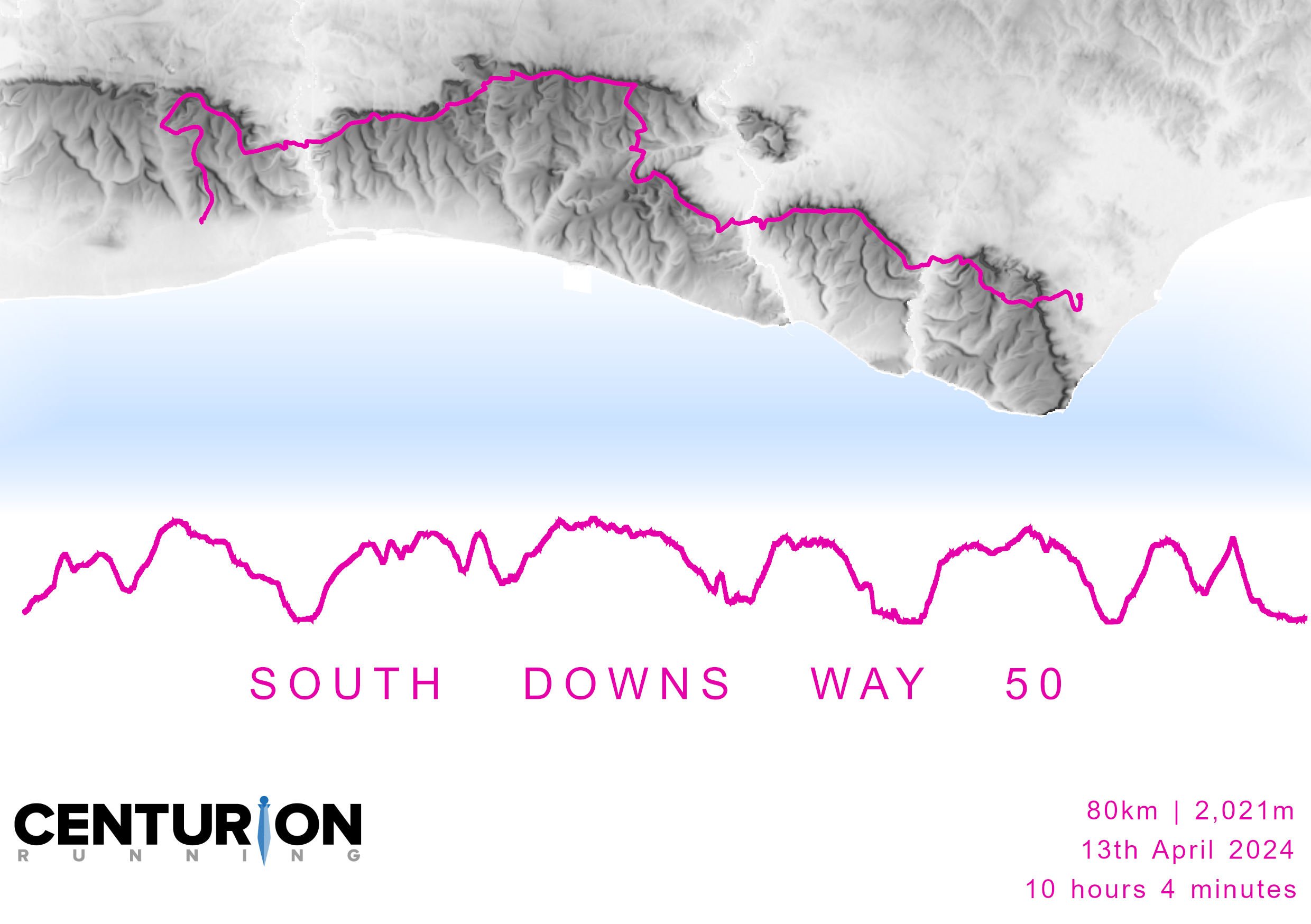
South Downs Way 50
The next couple of maps in this series also involve ultra marathons, I think I need to start looking at other themes!
This time one event that a friend did The South Downs Way 50, a gruelling 50 mile event running along the South Downs Way in one day, starting in Worthing and finishing in Eastbourne. It is completely self supported and we did pop up along the way to cheer her along, but that was all we could do, no giving sweets or extra help in any way.
She finished in a very impressive time of 10 hours 4 minutes!!!! Just incredible. Well since this particular friend also happens to love a map I decided to create one of her route from her GPX file that I ‘stole’ from her Strava account and turned it into a birthday card!
The result is shown here, I think there is still plenty more I could do, but I am enjoyed incorporated a raster file into this with the vector data.
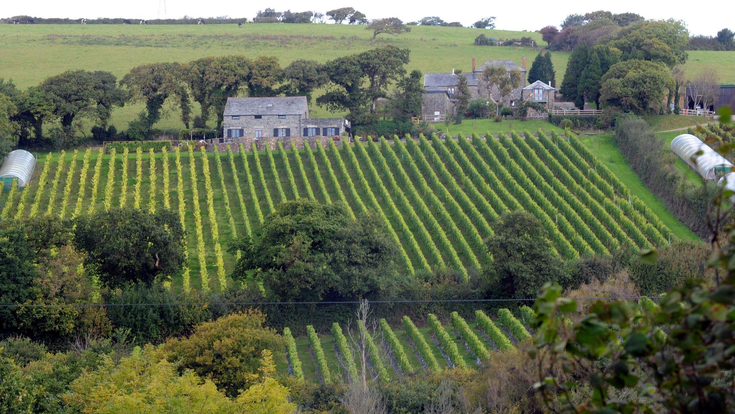
Scilly 60
Secondly, I’m including a map that has a similar theme, involves the same friend and some running! She and I attempted the Scilly60 back in June. This is a ultra with a difference….running the perimeter of each of the inhabited Scilly Isles. (60km in total in one day! But you need to make the boat).
Neither of us had visited the Isles of Scilly before this trip, this collection of islands are located approximately 36 miles off the south-west coast of England, you can only access them with a ferry (summer months only) flight or helicopter (weather permitting) so they are pretty remote. But wow they are stunning, with little development allowed this is a sanctuary for wildlife of all kinds on land and in the sea. We saw so many birds, seals, and plants.
When it came to race day, we lucked out with the weather, which can be extremely variable due to the Isles being out in the Atlantic. In reality the race involves five separate races, as you need to make the hooter and boat for each island in order to progress!! It is very technical terrain and while on paper seems very doable, it was hard and we both pushed as much as we could. You do get a little break between islands on the boat to refuel and stock up bags, but after 48km I missed the cut off on St. Mary’s by 6 minutes!! With 4 out of 5 islands complete, it felt like a solid effort for a first attempt! I decided to make a little map of this too for both of us!
-
ArcGIS Pro
-
GPX Files from Strava accounts
EU DEM opendem website
OS Boundary Layer
-
Organised within Catalog in ArcGIS Pro with separate project folders
-
SDW50
Convert the GPX files to point features, and turn points to line for the route.
Clipped the raster file for study area
Created a Feature Class to effectively create the polygon of the sea. Then used this to erase the portion that overlapped the OS boundary layer of the UK. The result was the land (raster layer) and sea (vector polygon) which I could symbolise.
Scilly 60
Convert the GPX files to point features, and turn points to line for the routes of each island we ran.
OS boundary layer used for the Scilly Isles, this was then symbolised.
-
IOn both maps I really wanted to focus on getting some effects of the sea. I used some tips from John Nelson to gradient fill the sea with a continuous element, so it blends nicely at the edge or close to the land.
The colours chosen for each route in the Scilly 60 was based on the race logo. For the SWD50 I used a colour to contrast with the greys of the DEM.
I added labels and logos to tie into the events themselves.


The Royal Geographical Society: Microlectures
Well most of this website has been about maps I’ve made in a digital medium, but this post is about two physical maps I have made as a result of the epic London to Barcelona challenge I supported last year.
Neil Russell, who is 65 years old and has Parkinson’s, ran 918 miles from London to Barcelona in the summer of 2023. He ran to Barcelona because this is where the World Parkinson’s Congress would be held and to demonstrate that despite having the condition, he won’t let it define him. He still can….run.
I cycled beside Neil for the entire journey and formed part of a tight knit team that made this possible. Other members of the team are Nicky, who did hours of unseen work to liaise with the charities Cure Parkinson’s and Parkinson’s UK as well as Imagine Cruising who sponsored Neil. Derek, a fellow ultra runner who did much of the winter training with Neil, and Oscar, Neil and Nicky’s labrador.
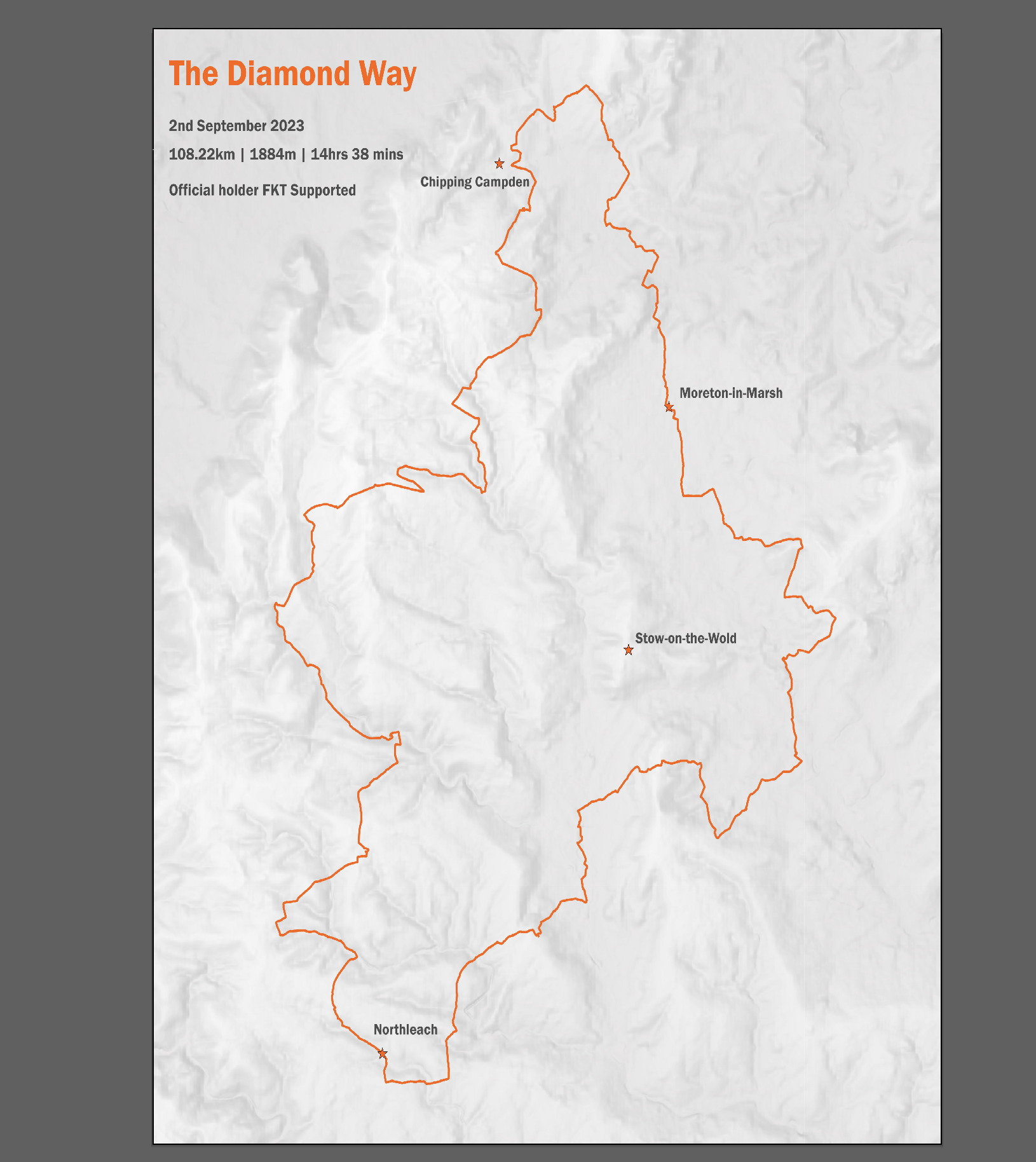
While Derek joined us for the first 3 days in the UK and the final day in Spain, he also undertook the Diamond Way in the Cotswolds to continue to fundraising efforts, as well as bag the FKT supported for this ultra route.
I’m still in awe of these ultra runners, I’ve run one marathon in my life to date along with several half distances. But this kind of running is next level. It is not so much about the medal and mass participation that most of us enjoy. It is about the solitude on the road and trail as well as in your own mind. I wanted to give a gift to both Neil, Nicky and Derek that I felt was fitting, a map.
Here are both maps that I had kindly printed professionally by The Cartographic Arts (check out his work here).
Finally, off the back of this challenge I had the opportunity to present our journey at The Royal Geographical Society in the Microlecture event last week. Truly an honor to be on stage in such a prestigious location. If you have 10 mins to spare and want to hear a bit more then the recording is here. I can also now add the initial FRGS after my name as I became a Fellow too!


Dropping a Pin
-
Google Maps and IPhone 8 for pin drops
Ride with GPX to route plan
-
Original GPX files for the route
Pins dropped by me
-
Using labels and starred locations to identify where we stop each day.
-
This was a case of combining route planning of preloaded GPX files in Ride with GPS and comparing to streetview on Google Maps and then primary field observations.
More about practical application of GIS tools the real world to find a simple solution for non GIS user.
-
Pin drops as starred locations in Google Maps. It looks a bit of a mess but the density of stars shows how we came to rely on this as part of our daily admin.
Have you ever used the phrase..’Just drop a pin’?
I do not mean literally dropping pins that we might when doing some needlework, I mean on a map.
In a world where we are connected more than ever, and the use of a map is almost ubiquitous with how we navigate our world. We can easily search with a smartphone on google maps to find the nearest anything…. coffee shop, restaurant, or garage. But I think in the last few years this has progressed; now we don’t just navigate to a place, we also put ourselves in the map. In fact we can also see other people in the map.
“The Marauder's Map” in Harry Potter comes to mind here, (and for those of you who have not read the books or watched the film, it is a magical map where the young wizards can see the live locations of various people travelling in real time around Hogwarts).
Have you ever used the location feature in WhatsApp, you know the one where you can press a button and it tells your recipient where you are and they can do the same, and you can even go for a ‘live location’ where you can both be moving at the same time and watch it in real time? The same is true of Apple with ‘Find My Friends’.
There is no doubt these features have numerous benefits from checking a loved one is home safely to getting dinner ready on time. And while GIS might just be another acronym it is something lots of people use everyday without even realising it!
London to Barcelona
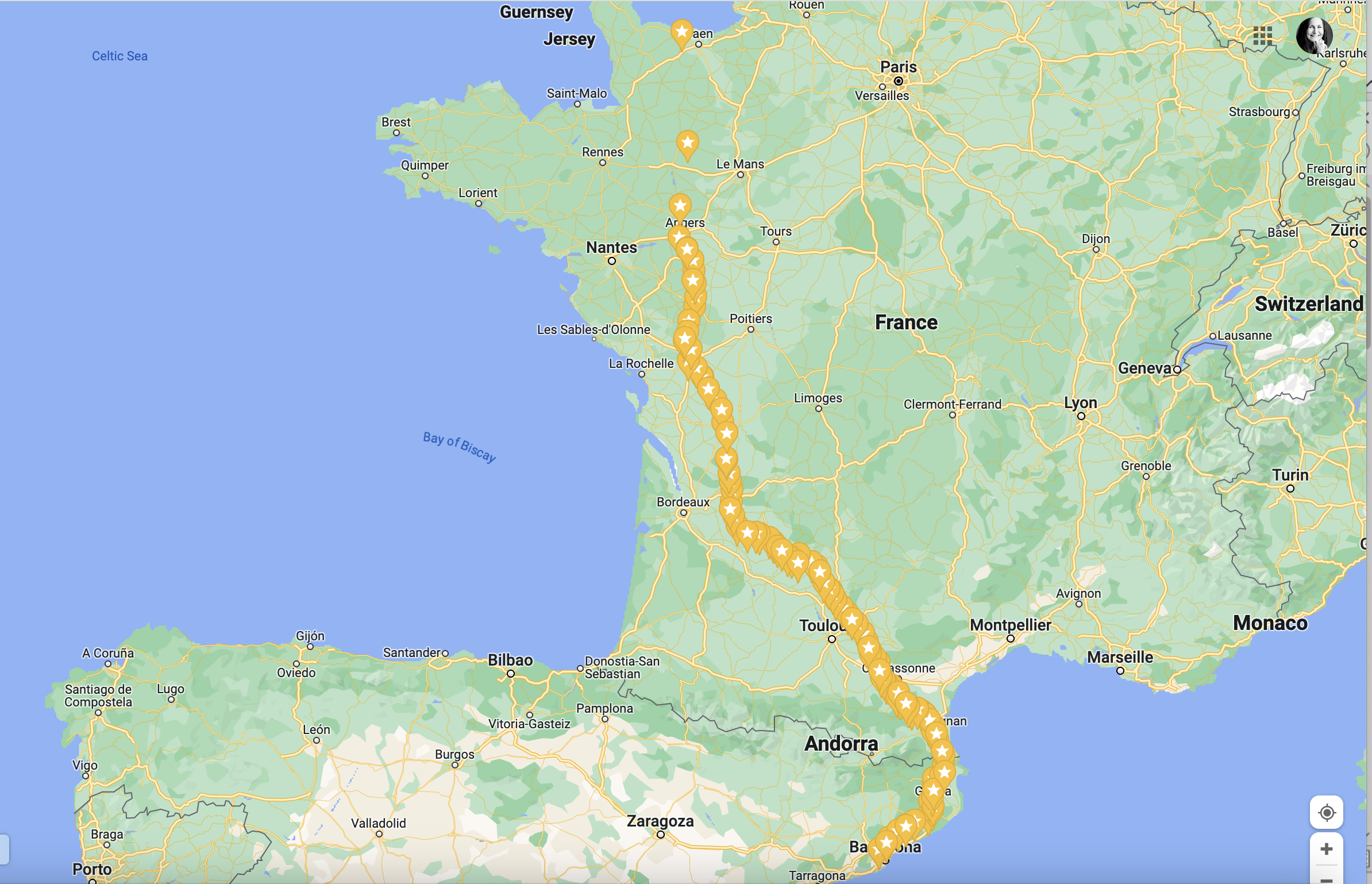
I recently completed an epic trip as part of a small team who travelled from London to Barcelona. Neil Russell, who is 65 and has Parkinson's, was running the whole way to the World Parkinson’s Congress to raise awareness and funds (that’s a whopping 1474 km or 916 miles over 5 weeks, an average of a marathon a day)! I was on my Brompton bicycle beside Neil for the full duration providing navigation, food, hydration, medication and motivation. We also had Nicky and Oscar (the dog) in a support vehicle, which we would meet up with at designated spots to take breaks and refill supplies throughout the day, and at the end of the day.
Finding a common language to communicate where we would be meeting became essential and part of my role was organising this. The route was already planned and we had a tracker (courtesy of Follow My Challenge), but we needed quick, clear way to communicate where we would meet for breaks and where we were relative to each other (runner and rider to support vehicle team).
Each morning we would have a chat about the day ahead, expected elevation, rural vs urban setting, weather conditions and how Neil was feeling physically. Based on all these factors feed stops would be chosen at set intervals ( for example 5 miles, 10, miles, 20 miles, end). I would then check the route and compare with google street view for suitable places to meet up and drop a pin for each feed stop. These ‘pin drops’ would be shared with Nicky so she had time to get to locations (not always the same way as the route itself) and had time to find safe and suitable parking. It worked a treat. The map below shows just how many pin drops we did and it actually shows how this evolved over the trip (increasing pin drops the further we got into the journey). (See Google Map here)
While there are plenty of fancy GIS tools out there which are perfect for certain jobs, this simple, easy solution for a non GIS professional in a real world event was ideal. I’m still astounded by the global coverage of google street view, an immense resource to help translate a 2D Representation of the world into what you are likely to see when you arrive at a location in a 3D world!


Cirencester - Where can I Park?
-
ArcGIS Pro 3.0.3, ArcGIS Online, ArcGIS Dashboards
-
Gloucestershire County Council
Zap Map
-
Used ArcCatalog to organise data. I completed the work in ArcGIS Pro 3.0.9.
-
Used OSM as a base map to create feature classes for the kerb side parking, car parks, and EV charging points.
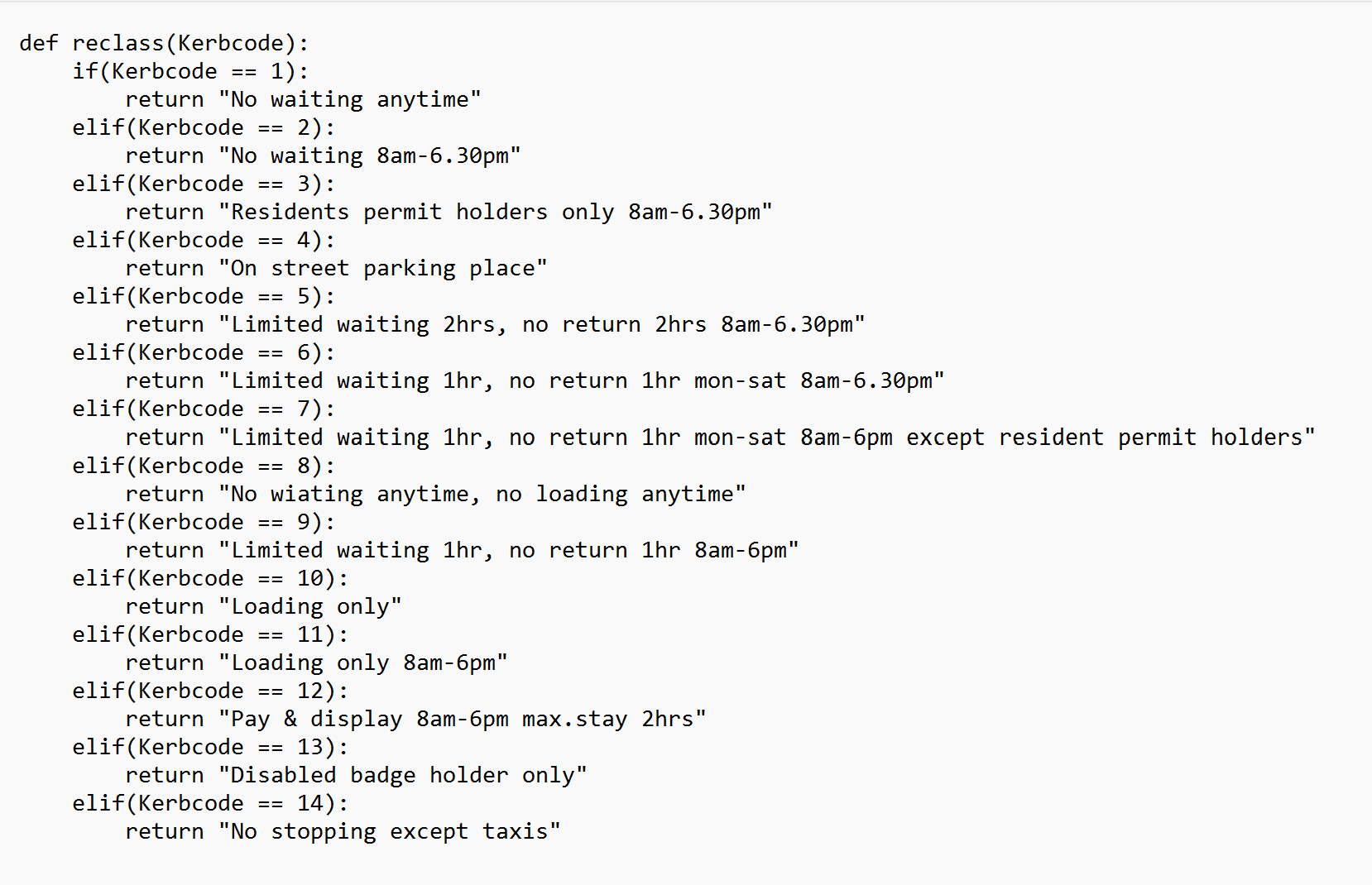
Processed the data in ArcGIS Pro to allocate a code for each type of parking based on different attributes (Python script shown). This made it much easier to symbolise later.
Web layers shared to ArcGIS Online and created interactive dashboard.
-
Parking symbolised by Pay & Display, Free, and Disabled. Additional information provided about EV chargers after consulting with EV users.
We have all been there, driven to a new place (or even a familiar place) and then needed to park our vehicle. With so many options and this becoming heavily digitised with apps on your phone and EV charging points, this is an area of great interest (even though I don’t own a car right now!)
I obtained data from Gloucestershire County Council, and used this to creature feature classes for all the kerb side parking and calculate codes for all the different types of parking using python (script show here). I added other feature classes for the car parks, EV charging points, and disabled parking using ArcGIS Pro.
Finally, I used this map to create a Dashboard to give users an interactive experience on parking options in Cirencester.

Golf Course Density in Great Britain
-
ArcGIS Pro 3.0.3
-
Ordnance Survey Data Hub
-
Used ArcCatalog to organise data. I completed the work in ArcGIS Pro 3.0.9.
-
Ordnance Survey data used as point features for golf courses.
Geoprocessing tools used to generate tessellation and then binning the golf courses to the generated hexagons.
-
Symbolised the hexagons with darker green representing a higher density of golf courses.
I’m a graduate from the School of Geography from the University of St. Andrews, Fife. This small town on the coast of Fife is also known as “The Home of Golf” and I was lucky enough to work on these famous courses and play a few.
I decided to map the golf courses of Great Britain using ArcGIS Pro and the generate tessellation tool. I produced tessellation of hexagons and the golf courses were binned to hexagons based on the location. In this map the darker green represents a high density of golf courses.


Cricklade Half Marathon (2022)
-
ArcGIS 10.7 for desktop, ArcGIS Online and ArcGIS Instant Apps
-
GPX files from my own recording of the event via Suunto Watch and Strava.
-
Used ArcCatalog to organise data. I completed the work in ArcGIS Desktop 10.7 and then converted to shapefiles which I uploaded to ArcGIS online.
-
Original data collection of GPX using Suunto Spartan watch.
Geoprocessing tools used to convert GPX files to features, points to line tool, and generate points on a line to get distance markers on the route in imperial and metric units.
I created new features for various things like start/end points and event HQ.
Once all features created, I converted to shapefiles to use on ArcGIS online and create the interactive map using ArcGIS Instant App.
-
Symbolised the route with direction arrows and relevant distant marketers and other key locations for the event.
I’m a keen outdoors enthusiast and have long enjoyed doing various sporting events outside from running events, cycling events, triathlons and even a quadrathlon!
While many of these events now provide you with a GPX file(s) on their booking sites so you can gauge the intensity of an event, this still isn’t ubiquitous.
Last September I participated in a local half marathon in Cricklade, Wilshire. A small event with a 10km held alongside the half marathon. Since there was no map on the booking site I decided to make my own.
Having participated, worked and volunteered at many events I know these kinds of interactive maps are useful for participants, spectators, support crew and volunteer crew especially when working in more remote regions.


Number of Vineyards by county in the UK (2020)
-
ArcGIS 10.7 for desktop
-
English Vine
Ordnance Survey for county data
-
Used ArcCatalog to organise data
-
Ordnance Survey data used to extract the county boundaries.
English Vine used to find the number of vineyards by county.
Used summary statistics to count the number of vineyards in each county and attach this to the county layer
-
Symbolised the data to show the counties with the higher number of vineyards in a deeper shade of purple.
As part of the #30daymapchallenge in November I have been creating some maps. The theme for Day 15 was Food and Drink. While the UK isn’t renowned for producing wine, there are a surprising number of vineyards in the UK. I decided to map the number of vineyards by county.
Despite the fact the UK isn’t usually associated with making wine, perhaps this will change with the warming climate. According to English Wine, there are over 700 vineyards in the British Isles range from extremely small (the smallest has just six vines) to almost 90 hectares. The largest producer is Nyetimber with seven separate sites.
There are a variety of growers from commercial producers like Chapel Down and Neytimber to hobbyists who dabble in production on a small scale.
It is no surprise the greater number of vineyards are found in the South and East which has the warmer weather. Looking at the raw data from English Wine, it is clear that the number of vineyards has doubled over the last decade and the volume of bottles produced has also increased by almost threefold.

London Travel Zones and the London Underground, UK
-
ArcGIS 10.7.1 for desktop, time-slider used for animation.
-
Ordnance Survey for stations
ESRI Living Atlas for lines (mwells)
Travel Zones digitized based on stations
-
Used ArcCatalog to organise data.
MS Excel to organise and process travel zones
-
Ordnance Survey data used to extract Underground stations by selecting data from the data on all train stations in London.
Travel Zone data taken from Wikipedia. This data was uploaded and joined to Underground Station Data.
Underground Lines taken from ESRI living atlas.
London Travel Zones created with Feature layers and polygons drawn using Editor Toolbar based on station locations. Erase Tool uses to create concentric rings.
-
Time-slider used to create time enabled layers for stations and lines on the Travel Zones and underlying base outline of Greater London.
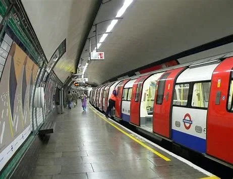
As part of the #30daymapchallenge in November I have been creating some maps. Day 6 was network where I decided to create an animation of the London Underground Stations and Lines.
London is a global city and has a vast network of public transit which includes trains, trams, buses, tubes, boats and even a cable car! The London Underground is over 150 years old and has changed enormously over its lifespan.
Having lived in London for a decade I have used all the lines but have certainly not visited all of the 273 stations! The Underground Network covers Inner and Outer Boroughs but as you can see from this map, northern London has better coverage and outer boroughs are usually linked by just one line. The evolution of the network has expanded with the growth of the city, and parts of the lines are actually above ground outside the central zones.
The Travel Zones dictate the cost of tickets and managed by Transport for London, since some stations lie close to zone boundaries there are sometimes petitions make changes. The Travel Zones on this map are only representations.

London Travel Zones with Underground Stations and Lines animated

Tesla Superchargers and Premium Supermarkets, UK
-
ArcGIS 10.7.1 for desktop
-
-
Used ArcCatalog to organise data.
Used online geocoder to plot Tesla Supercharger Points
-
Tesla Supercharger locations were added to an excel document, geocoded. XY event layer created.
Supermarket KML files added to ArcGIS Desktop.
Further analysis would be interesting to do, especially with data from either Tesla, M&S, Waitrose on use of chargers and customer spend.
-
Outputs of points mapped, symbolised.
As part of the #30daymapchallenge in November I have been creating some maps. Day 1 was points where I decided to plot the Tesla Supercharger points in the UK and the locations of two premium supermarket chains (Little Waitrose and M&S Simply Food).
Since Tesla are a premium brand that have a starting price of £40,000, I thought it would be interesting to see if there was a pattern between this brand and other premium brands. Tesla claim that you can use their superchargers for 15 minutes and it will give you a 200-mile range. This would be enough time for a customer to visit a supermarket, grab a drink or snack and be back at their vehicle.
Since 2005 premium supermarket brands in the UK have expanded to operate in less traditional location such as airports, train stations, and motorway service stations. Two brands that are visible in this area are Little Waitrose and M&S simply food.
This map plots the current Tesla Supercharger points in the UK (as of Oct 2022) and the locations of two premium supermarket chains (Little Waitrose and M&S Simply Food) at motorway service stations. There is scope to extend the analysis to include the supermarket locations beyond those at service stations, as well as analysis on proximity of chargers to supermarkets. I’m also sure there would be interesting analysis in the aggregation of customer data to explore customer spend during the time to charge their car.


Fire Hazard Zones - Greater London, UK
-
ArcGIS 10.7.1 for desktop, extensions: Spatial Analyst, 3D Analyst
-
-
Used ArcCatalog to organise data.
-
July 2022 Fire incidents were plotted on a map creating new feature classes and buffer tool used with 1km radius.
Weather data analysed using select by attributes to compare conditions between 2022 and preceding 5 years.
Supervised classification conducted on landsat image to get land use for Greater London.
Modelbuilder used to derive show greenspace at risk of fire damage based on July 2022 fire incidents.
-
Output of modelbuilder were polygons representing grassland within the 1km radius of the July 2022 fire incidents. Displayed on map in red.
Wildfires are a natural disaster that are seen around the world, occur naturally and can regenerate the land. However, when they occur close to human habitation they pose a risk to human life and property. Globally we are seeing a trend in more unstable extreme weather events that are happening with increasing frequency. In terms of wildfires the impacts have been witnessed across North America, Australia and now in Europe too.
Wildfires are not typical in the UK, but with recent changes in weather patterns due to climate change there have been several this summer due to unusually high temperatures and a lack of precipitation causing the ground to be very dry.
This project specifically focuses on Greater London, a densely populated global city, which experienced several fires this summer in July and August 2022. It seeks to map which areas of the city were impacted the most by the fires of July 2022 in terms of damage to human property and potential loss of life.
